loading
Even taking into account the loss of about 60% of traffic, we are one of the leaders in online retail in Armenia. The marketplace contains more than 20,000 products, most of which the user does not even see. The average time a user spends on the site is 140 seconds, which is very weak for a marketplace.
The goal of the redesign is: at least to triple the time spent on the website, аs well as stimulating sales growth and increasing customer loyalty.
crossroad.com
Marketplace
UX design
Mobile
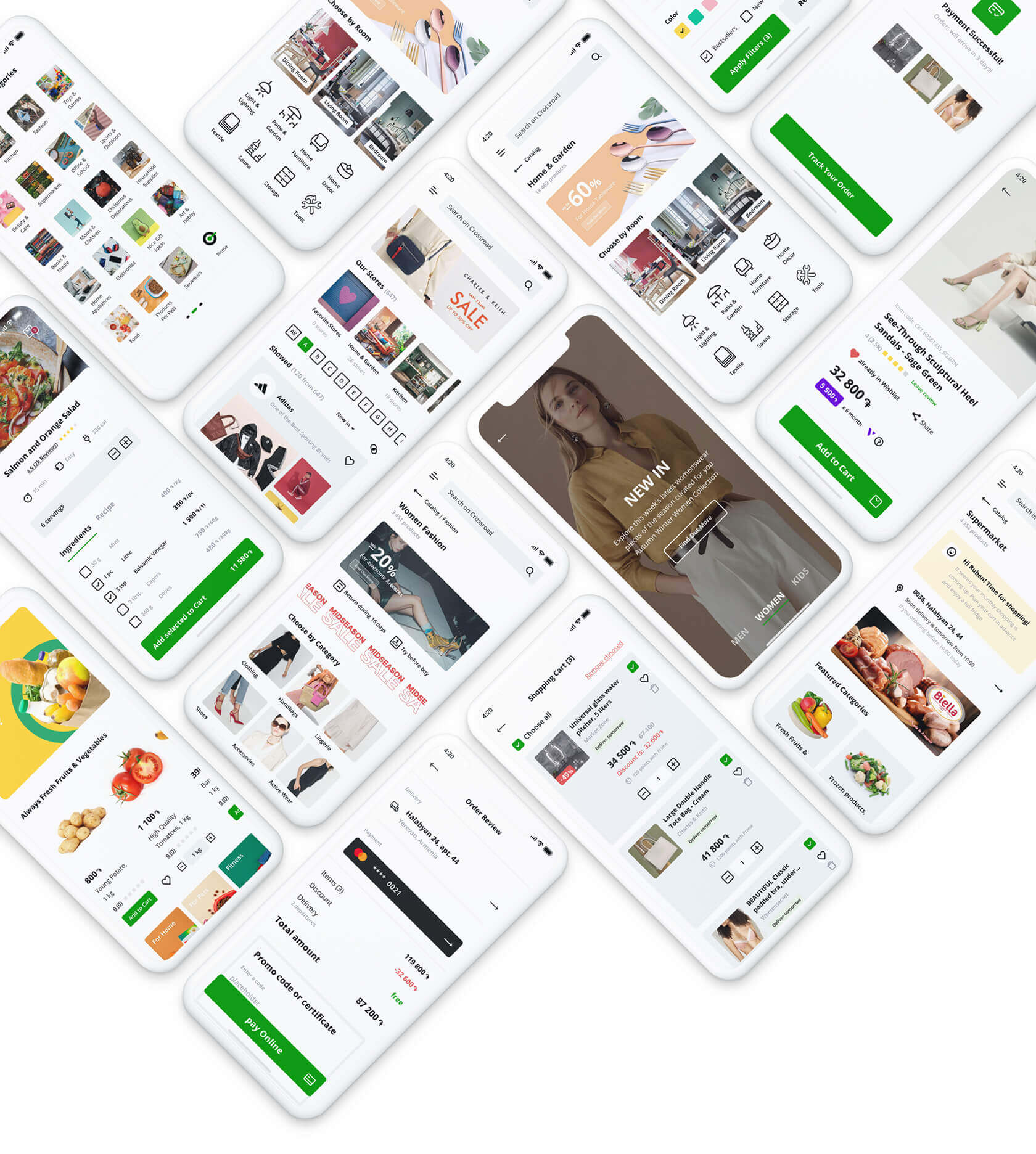
There are more products on the home page. The user is shown personalized selections - they are compiled on the basis of order history, product views, and search queries.
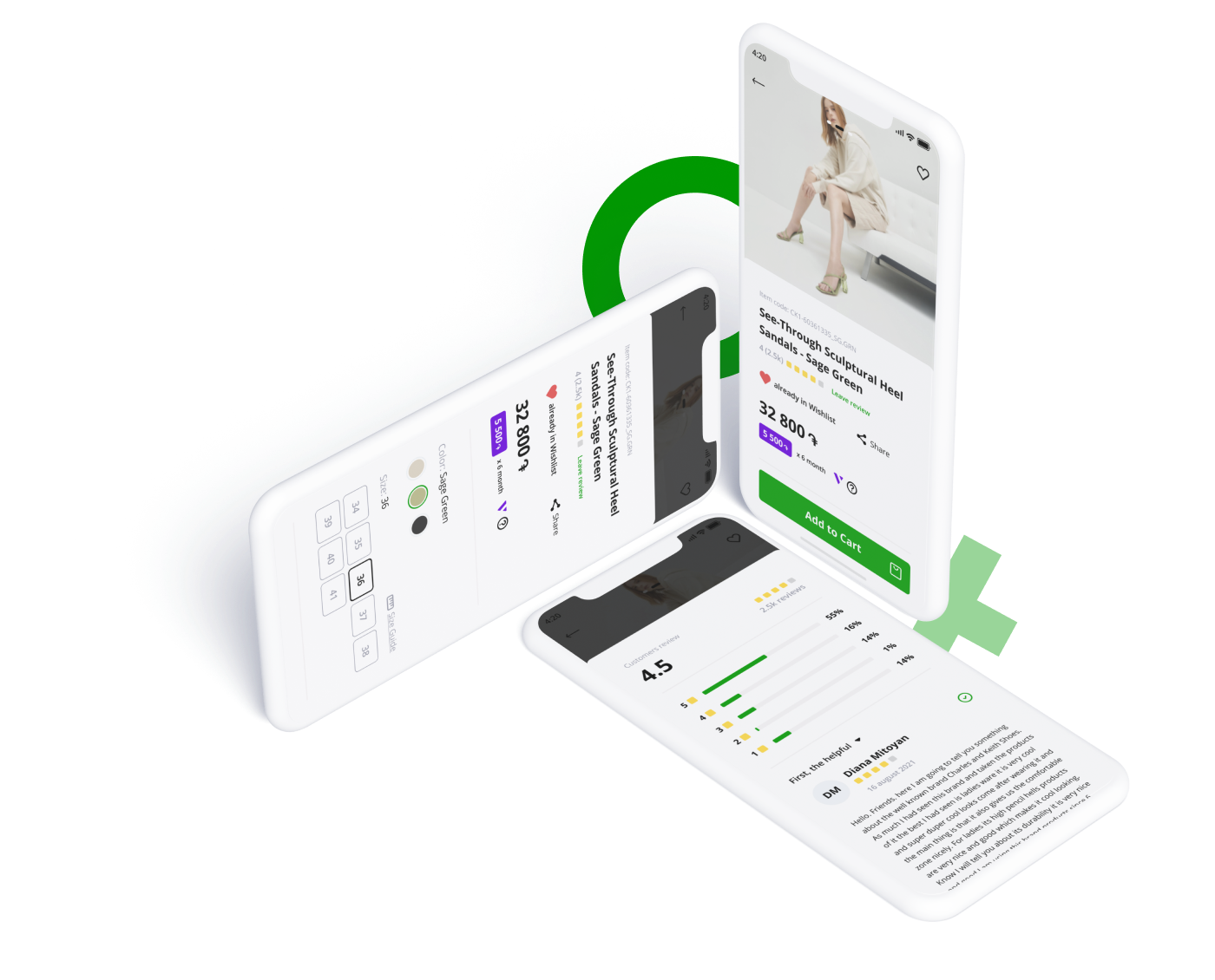
The mobile version is now simple, clear, and pleasing to the eye. In addition to the standard tools of a convenient marketplace, interactive sections have been developed which prolong the user's time on the site.
The mobile version is now simple, clear, and pleasing to the eye. In addition to the standard tools of a convenient marketplace, interactive sections have been developed which prolong the user's time on the site.
interactive
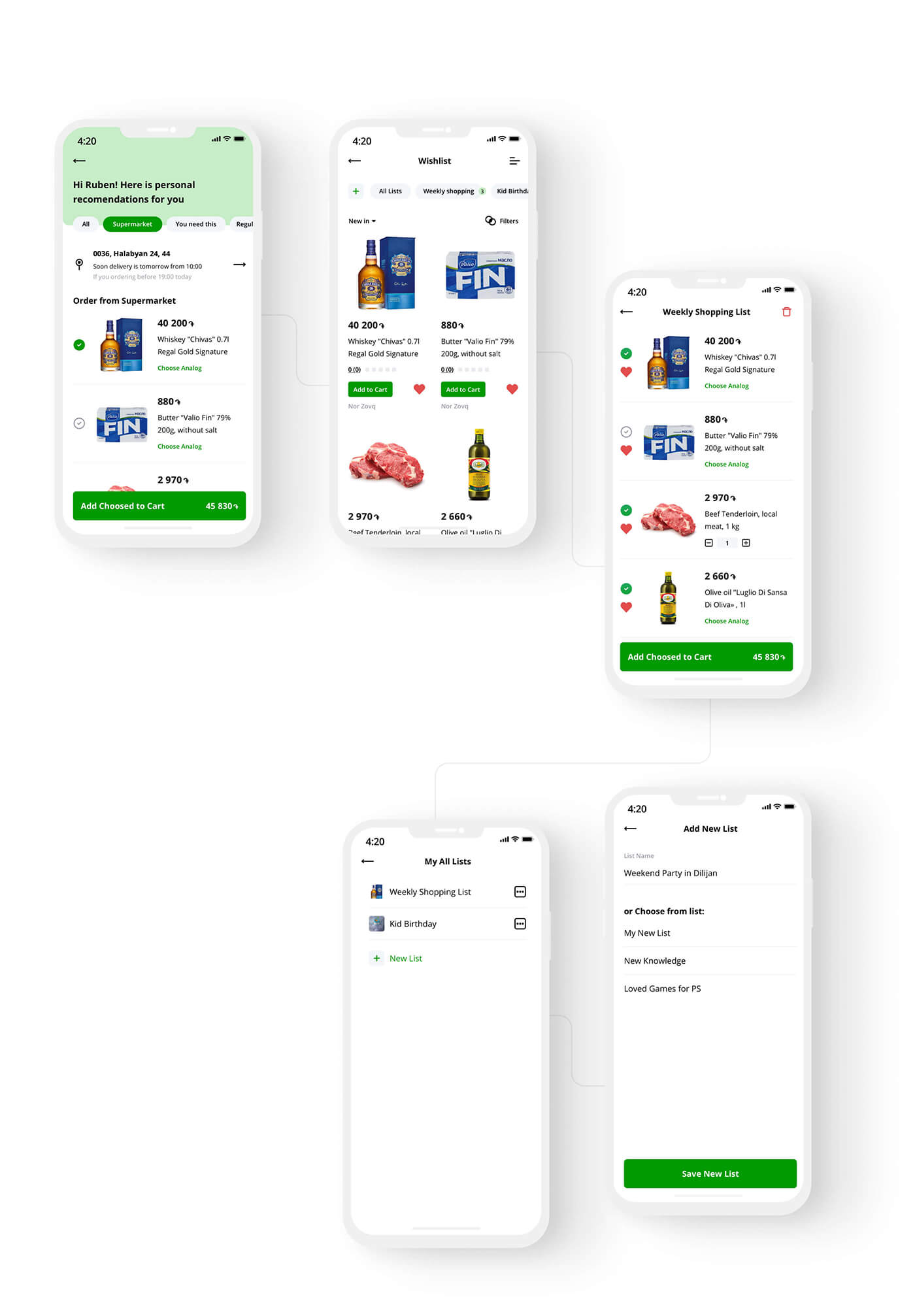
We paid exceptional attention to personal selections. There are two types of lists: those created by the marketplace and those created by the user. Pickings can be completely different, from birthday wishlist to repeatable weekly purchases.
Personal lists
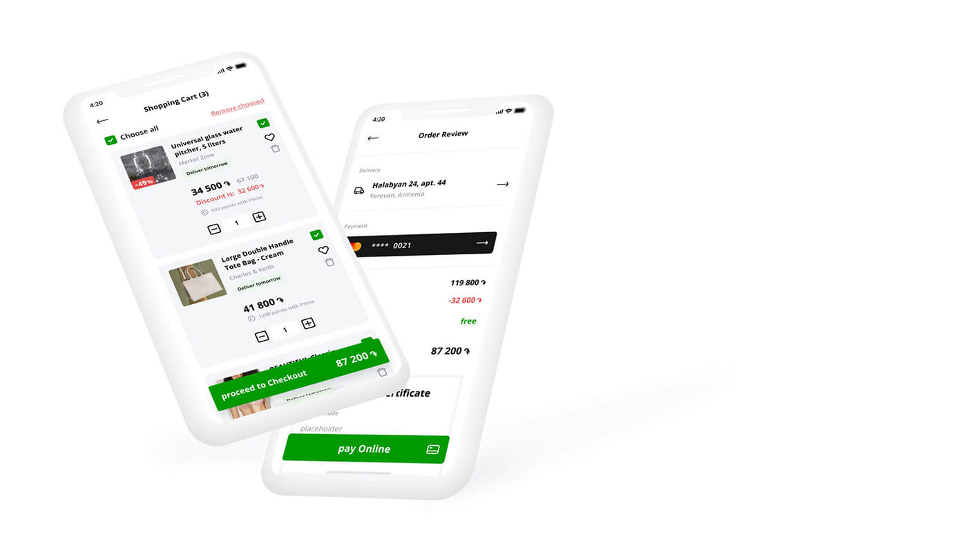
Now the store has a new shopping cart and fast checkout - the shopping process has become more convenient.
Previously customers had to make nine steps to place an order. Now there are only four. And everything is on one page: delivery selection, payment information and promo codes.
Previously customers had to make nine steps to place an order. Now there are only four. And everything is on one page: delivery selection, payment information and promo codes.
Shopping cart
Interactive elements have been developed for the key sections. For example, furniture can be selected directly from the interior created by the team.
The product card is one of the most important pages for a marketplace. We tried to ease the buyer's pain as much as possible, both in the mobile and desktop versions.
dreamer@rasoyan.com
+374 94 09 25 52
+374 94 09 25 52
Let's Make It Happen
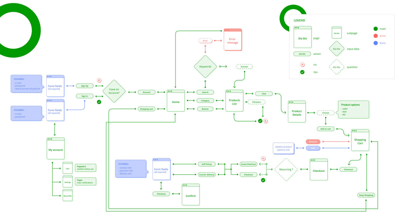
user flow
It was decided to show all the news of the marketplace via stories that have already become customary for the user.
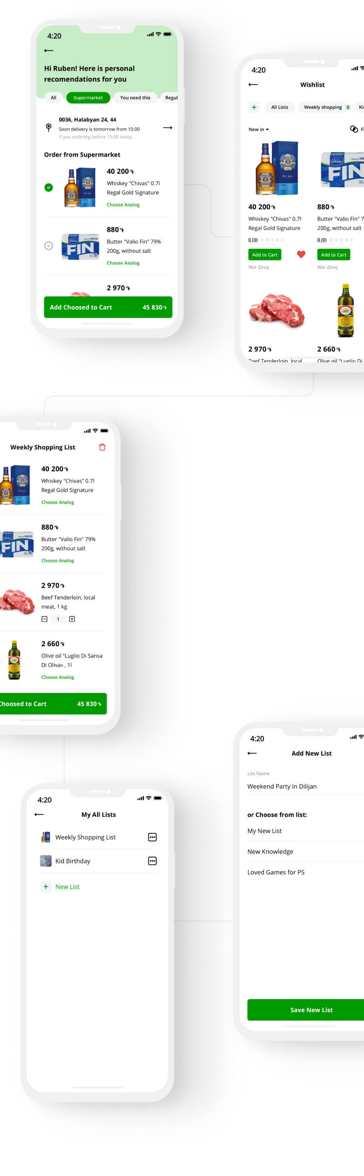
Selections can be shared with friends, buy products from the list in 1 click, and much more.
Даже с учетом потери около 60% трафика, мы являемся одним из лидеров онлайн-ритейла в Армении. На маркетплейсе представлено более 20 000 товаров, большинство из которых пользователь даже не видит. Среднее время, которое пользователь проводит на сайте, составляет 140 секунд, что очень мало для маркетплейса.
Цель редизайна: как минимум утроить время, проведенное на сайте, а также стимулировать рост продаж и повысить лояльность клиентов.
путь пользователя
На главной странице представлено больше товаров. Пользователю показываются персонализированные подборки - они составляются на основе истории заказов, просмотров товаров и поисковых запросов.
Мобильная версия стала простой, понятной и приятной для глаз. В дополнение к стандартным инструментам удобного маркетплейса разработаны интерактивные разделы, которые продлевают время пребывания пользователя на сайте.
Мобильная версия стала простой, понятной и приятной для глаз. В дополнение к стандартным инструментам удобного маркетплейса разработаны интерактивные разделы, которые продлевают время пребывания пользователя на сайте.
интерактив
Для ключевых разделов были разработаны интерактивные элементы. Например, мебель можно выбрать непосредственно из интерьера, созданного командой. Все новости рынка было решено показывать через истории, которые уже стали привычными для пользователя.
персональные подборки
prototyping
branding
art direction
UX/UI
prototyping
branding
art direction
UX/UI
prototyping
branding
art direction
art direction
branding
prototyping
prototyping
UX/UI
UX/UI
© 2021 Ruben Asoyan


